

Image: iStockphoto/NicoElNino
While we work hard to produce important and useful data analytics reports, we know that not all of the data we present is being used to its fullest extent. In August 2023, IDC reported that unstructured data is underutilized, undervalued and underfunded. Its survey of 400 IT leaders revealed that most of businesses’ unstructured data stays in silos, with only a fraction of it being analyzed and acted upon, leading to missed opportunities for valuable insights and actionable recommendations.
So now the question is: How much of the data we analyze and report on is being actively used?
The report usage question has plagued IT from the beginning. Most IT staff know that the 80:20 rule applies: 20% of the reports produced for the business do 80% of the informing. Meanwhile, unused and seldom-used reports pile up on servers.
To prevent wasted efforts in dashboard and analytics report development, here are eight best practices to follow:
- Stay tuned with the business
- Visualize dashboards, and enable easy drill-down
- Ask next-generation report questions
- Enable multi-level usage clearance and universal access
- Verify data integrity
- Synchronize data with like data in the enterprise
- Standardize report development and formats
- Measure for use and perform post-mortems
- Incorporate data storytelling techniques
- Select the right data analytics tool
1. Stay tuned with the business
How many times does IT meet with users about a report design and then go away to develop something else? More often than you think.
What happens is that IT, as it works on the report back in the office, thinks of new ways to slice and dice the data and decides to embellish the original request with additional functions and features.
This is a great practice — and can pay off “big” for users — as long as the embellishments don’t create so much report drift that the original business request is missed.
2. Visualize dashboards, and enable easy drill-down
Interactive features such as filters, drill-through capabilities and tooltips can enhance the usability of the report, enabling users to explore the data from different perspectives and obtain the insights they need.
Financial departments are comfortable working with spreadsheets and figures, while sales might prefer a pie chart, manufacturing might prefer bar charts and logistics might prefer a worldwide map (Figure A).
Figure A
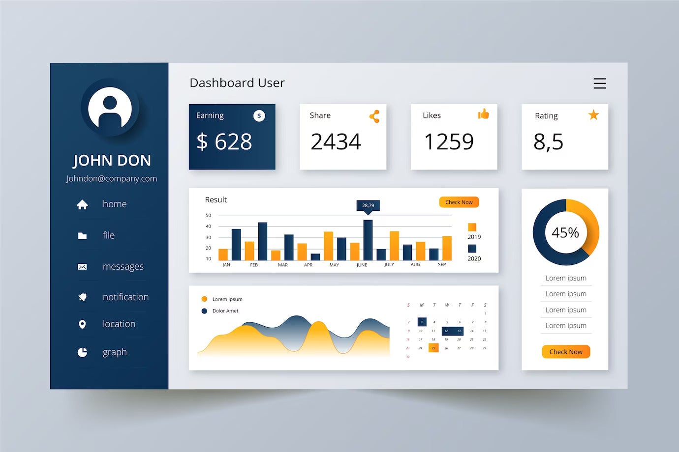
Finding the optimal visualization of summary-level data for each user is a major victory in itself. It immediately creates a level of comfort for the user.
Another usability factor is an easy drill-down into more detailed analytics data. For example, if a user is working with a map summary visualization and wants to know more about their truck fleet in Atlanta, they should be able to click on Atlanta so they can get to the details.
3. Ask next-generation report questions
Today, a user might be asking for a report that tells them how much product flows through each of their production lines hourly, daily and monthly. Next year, they might want to know how much product was returned for defects and which production lines produced it.
From a data standpoint and from a report data field definition standpoint, it’s always a good idea to ask the user what he might want to see from a given report in the future, so businesses can easily scale to that and keep the report relevant.
4. Enable multi-level usage clearance and universal access
At any given point, a new user in a new business area might request access to a report. At all points in time, the controlling user of a given report will also want to give out security clearances at different levels to people, such as a vice president of manufacturing being able to see all manufacturing activity, but the manager of Plant B only being able to see information for Plant B.
SEE: Building analytics data access paths for the best results.
Analytics report designs should clearly designate security access levels and who should control and authorize them (Figure B). These reports should also have the technical flexibility to be accessed by anyone in the enterprise who is cleared for use.
Figure B

5. Verify data integrity
Before any analytics report or dashboard is cleared for use and moved to production, the data it uses and reports should be cleaned and verified for accuracy. This involves performing data preparation and validation processes, such as data deduplication, outlier detection and checking for missing or inconsistent values.
Rigorously verifying data integrity before deploying analytics reports to production reduces the risk of making decisions based on inaccurate or incomplete information. This, in turn, enhances the credibility of the reports.
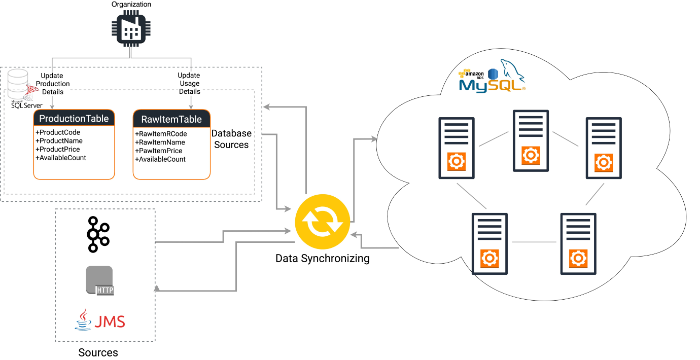
6. Synchronize data with like data in the enterprise
If sales reports use the data field of “customer,” which refers to individual buyers, and manufacturing systems uses the term “customer,” which refers to individual buyers but also to a rework shop within the company, this data should be synchronized so there is a common definition that enables sales and manufacturing to talk about the same thing.
Data synchronization is done in the database area of IT (Figure C). It’s important because information discrepancies and internal disagreements can arise when two different departments think they are talking about the same thing but aren’t.
Figure C
7. Standardize report development and formats
Standardizing the report-producing tools used as well as the formats various reports used ensures uniformity across the enterprise and lessens confusion for users. This includes standardized templates, data definitions, naming conventions, report layout and design principles.
8. Measure for use and perform post-mortems
Annually, IT should review analytics reports for the amount of use they’re getting. If a report hasn’t been used or was seldom used, IT should check with end users to see if the report is still relevant.
It’s equally valuable to conduct a post-mortem evaluation. Which content, feature and function characteristics of the reports were most widely used? What in the reports wasn’t used? What can be taken away from the evaluation to improve the quality of analytics reports? These are all important questions to ask to ensure the reports meet the end users’ needs.
9. Incorporate data storytelling techniques
Data storytelling is the art of building a compelling narrative based on complex data and analytics to effectively communicate insights and make them more memorable (Figure D).
Figure D

Data analysts or business leaders looking to inspire action on the part of their teams must include the four elements of data storytelling: character, setting, conflict and resolution. By adding these components, organizations can elevate the impact of analytics reports and make them more engaging and persuasive.
10. Select the right data analytics tool
Choosing the right data analytics tool is important for the effectiveness of analytics efforts. The best tools are usually easy to use and are scalable. They also include data integration capabilities and visualization options, allowing businesses to connect to various data sources and create interactive reports easily.
PREMIUM: Compare features for data analytics software and services.